Sambrow
Elevating a Beauty Sanctuary Experience
A complete website redesign that doubled booking conversion rates while capture the brand’s luxury essence.

+121%
Booking rate
-28%
Bounce rate
Session duration
+36%
Team
UX Lead
Duration
Scope
Research, UX/UI Design.
8 weeks
Context & Challenge
Sambrow is a high-end beauty sanctuary rooted in tropical inspiration and Japanese-style skincare philosophy. They offer semi-permanent makeup, gentle medical aesthetics, and therapeutic lymphatic massages. Despite a strong offline reputation, their digital presence fell short in communicating their luxury positioning, The existing website was fragmented, visually outdated, and conversion rates hovered under 20%. Users struggled with service clarity and faced up to six clicks before booking, which often led to drop-offs.
Discovery & Insights
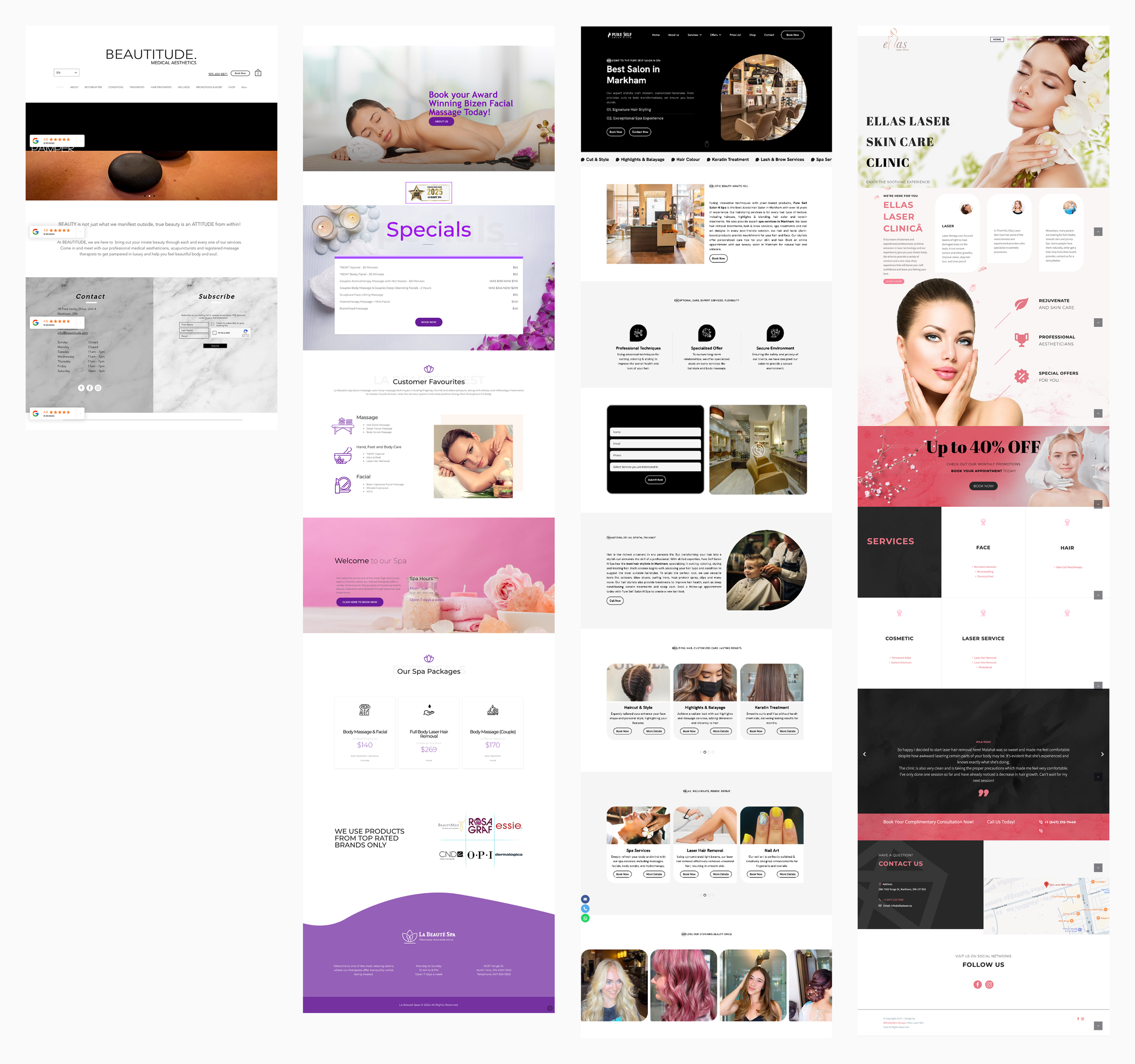
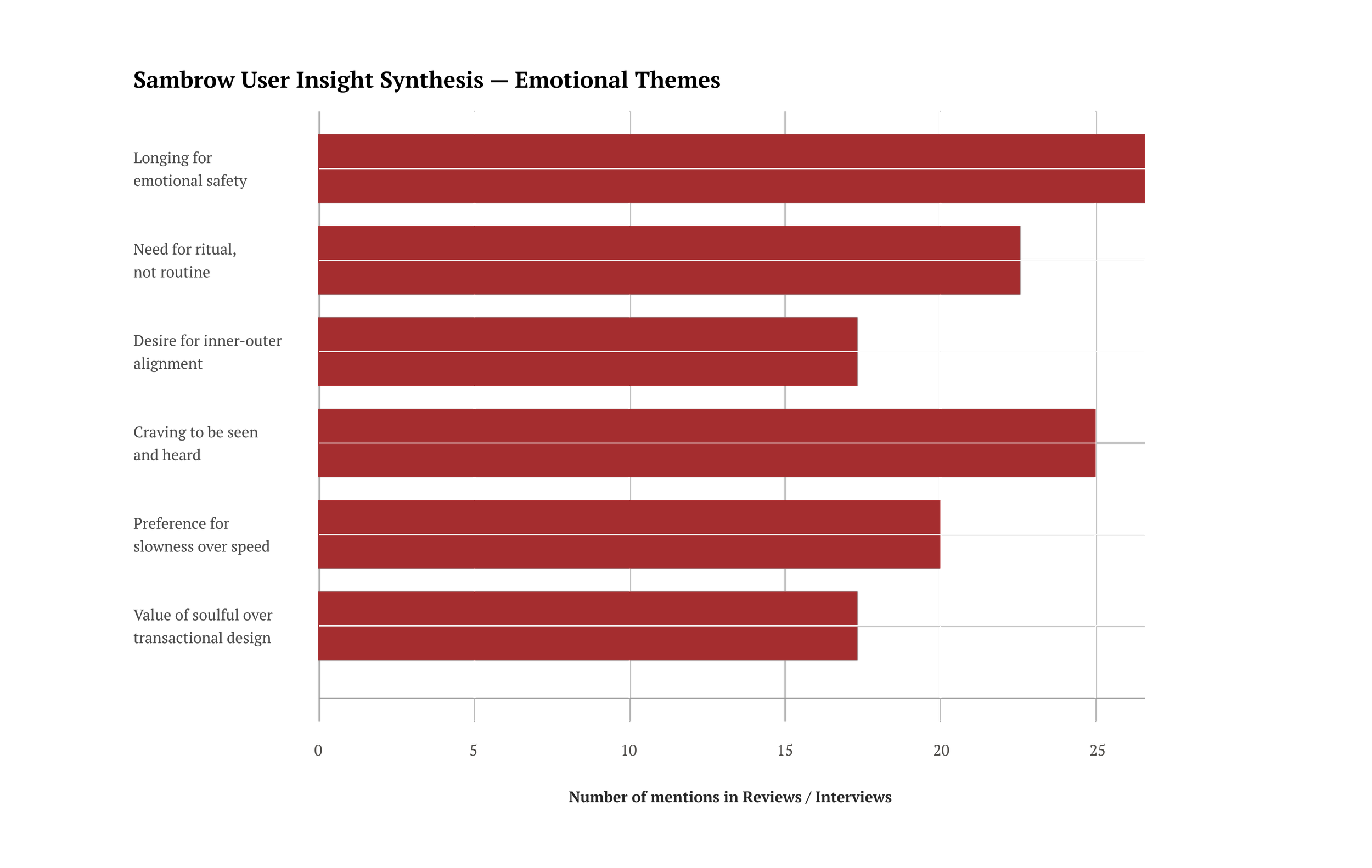
I began with a discovery phase, conducting a heuristic audi, mapping competitor journeys against premium wellness brands like Saje and Body Biltz, and reviewing over 120 client reviews. A recurring insight stood out: clients valued not just the service, but the feeling of being cared for. This shifted our approach from a purely transactional booking flow to an immersive, trust-driven experience. I facilitated a brand workshop with the client to align on tone of voice, emotional triggers, and visual identity, then distilled the findings into three opportunities, streamline booking, amplify emotional connection, and visually align the website with luxury beauty expectations.
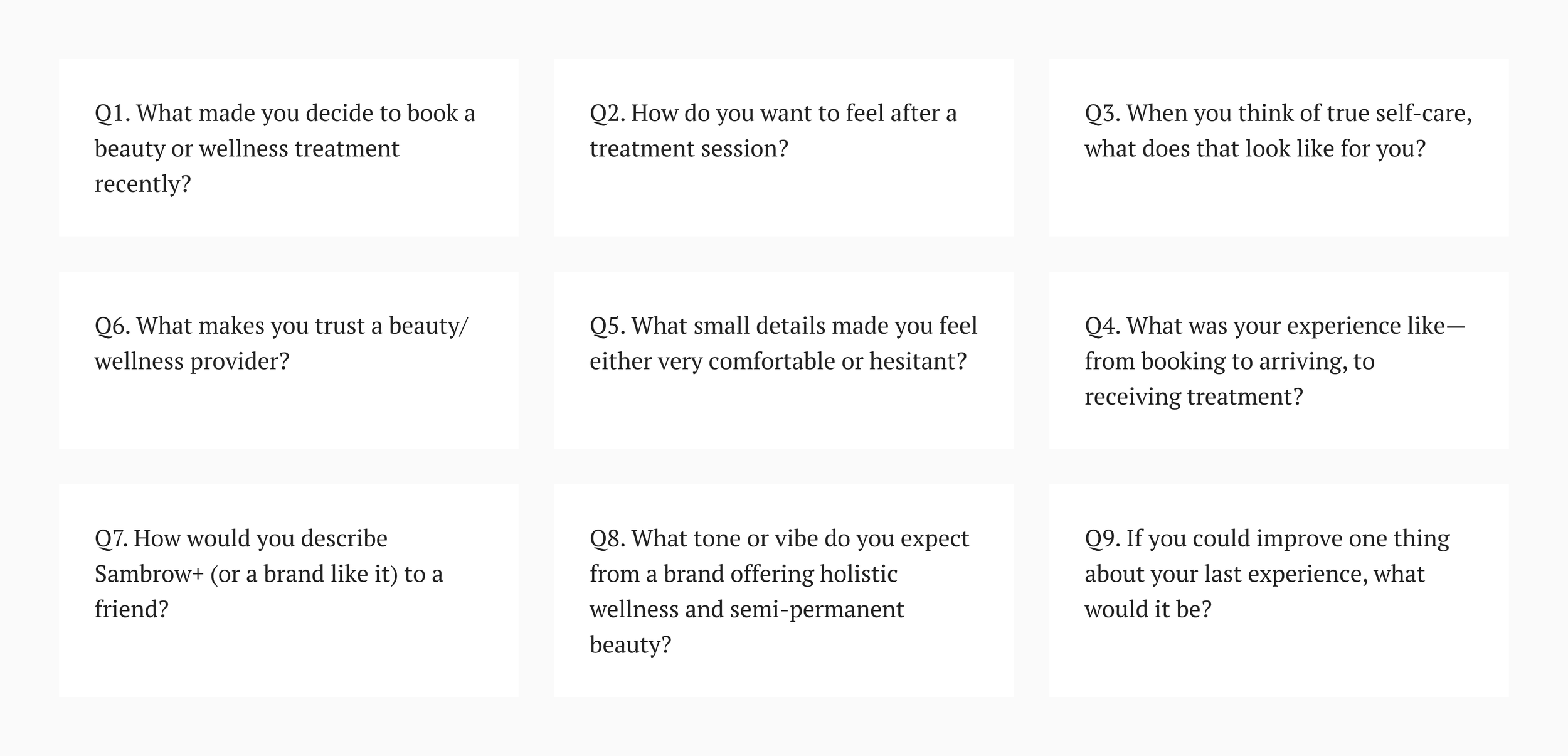
Some of the questions asked during the user interview process.
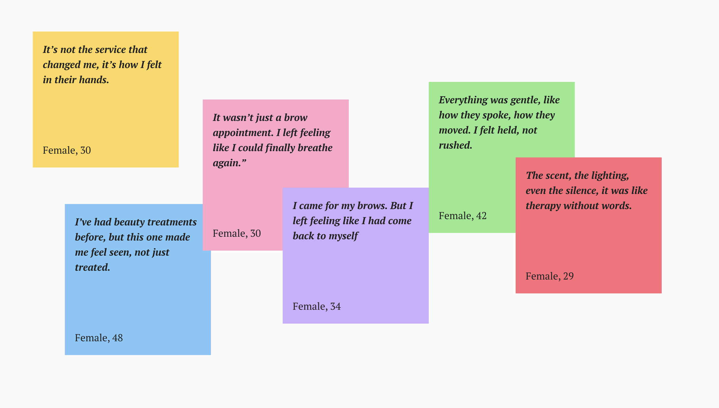
Some of the feedback from existing clients through the interviews.
This synthesis led to a transformative insight: the website could not behave like a conventional service platform. It had to become a digital mirror of the Sambrow experience a gentle, spacious interface that held emotional nuance and allowed for self-reflection. Every scroll needed to feel like an exhale. Every word had to carry the weight of care. Every flow needed to be ritualistic, not robotic.
Design Execution
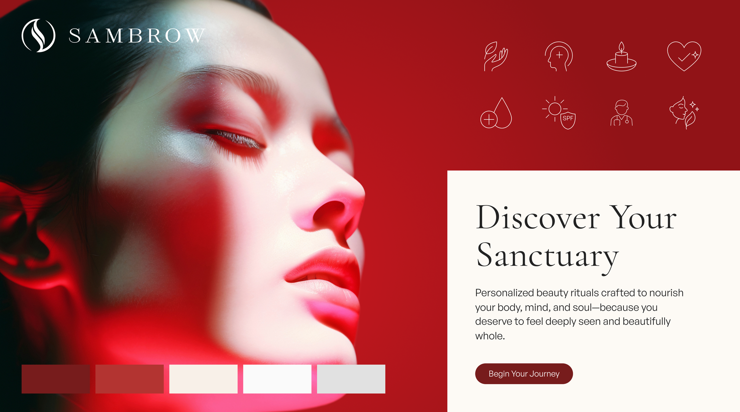
I reduced the booking flow from six steps to three, cutting user friction significantly. I developed a visual identity system of warm tropical tones, soft gradients, and elegant typography to reinforce brand luxury. Service pages were redesigned with treatment explanations, before-and-after visuals, and well-timed calls-to-action at moments of peak intent. Mobile optimisation became a top priority, as 72% of visitors accessed the site on mobile. Throughout, I collaborated closely with developer to ensure pixel-perfect implementation and smooth animations.
Some of the questions asked during the user interview process.
Some of the feedback from existing clients through the interviews.
-
I just want to buy a plan and know what i'm getting but why does it feel so complicated right now?
- Customer insight from ethnographic interview
-
It looks like three different websites were stitched together. I never know if i'm in the right places.
- Mid-level enterprise user, on the legacy portal
-
I end up calling support because the flow just... disappears on mobile halfway.
- Customer on usability issue with checkout.
Outcome & Impact
Within the first month of launch, booking completions increased from 19% to 42%, a 121% uplift. Bounce rates dropped by 28%, and average session duration improved by 36%. The new testimonials section became one of the most visited pages, deepen trust. Client feedback emphasised that the site “Finally feels like Sambrow,” bringing the in-studio warmth into the digital space.

We translated strategy into screen—crafting an intuitive, visual-first interface across the entire user journey.

We designed a mobile-first experience that empowers users to explore, compare, and purchase with confidence.
The results
The newly launched omnichannel platform created meaningful improvements in both customer engagement and business efficiency:
Improved customer satisfaction scores (NPS) across digital touchpoints
A scalable foundation for future AIS product and service rollouts
A seamless experience built for scale and satisfaction
reduction in purchase
journey drop-off
30%
Accelerated design velocity across 3 platform using reusable DLS
40%
+45% in completed purchases, a 38% drop in checkout drop-offs, and 60% more customers using self-service. The results spoke louder than the pixels.
